Paulina Meska

Bringing structure to an
evolving healthcare product

Role:
UX/UI Designer
Company:
Zenitech
Client:
US healthcare navigation company
Year:
2026
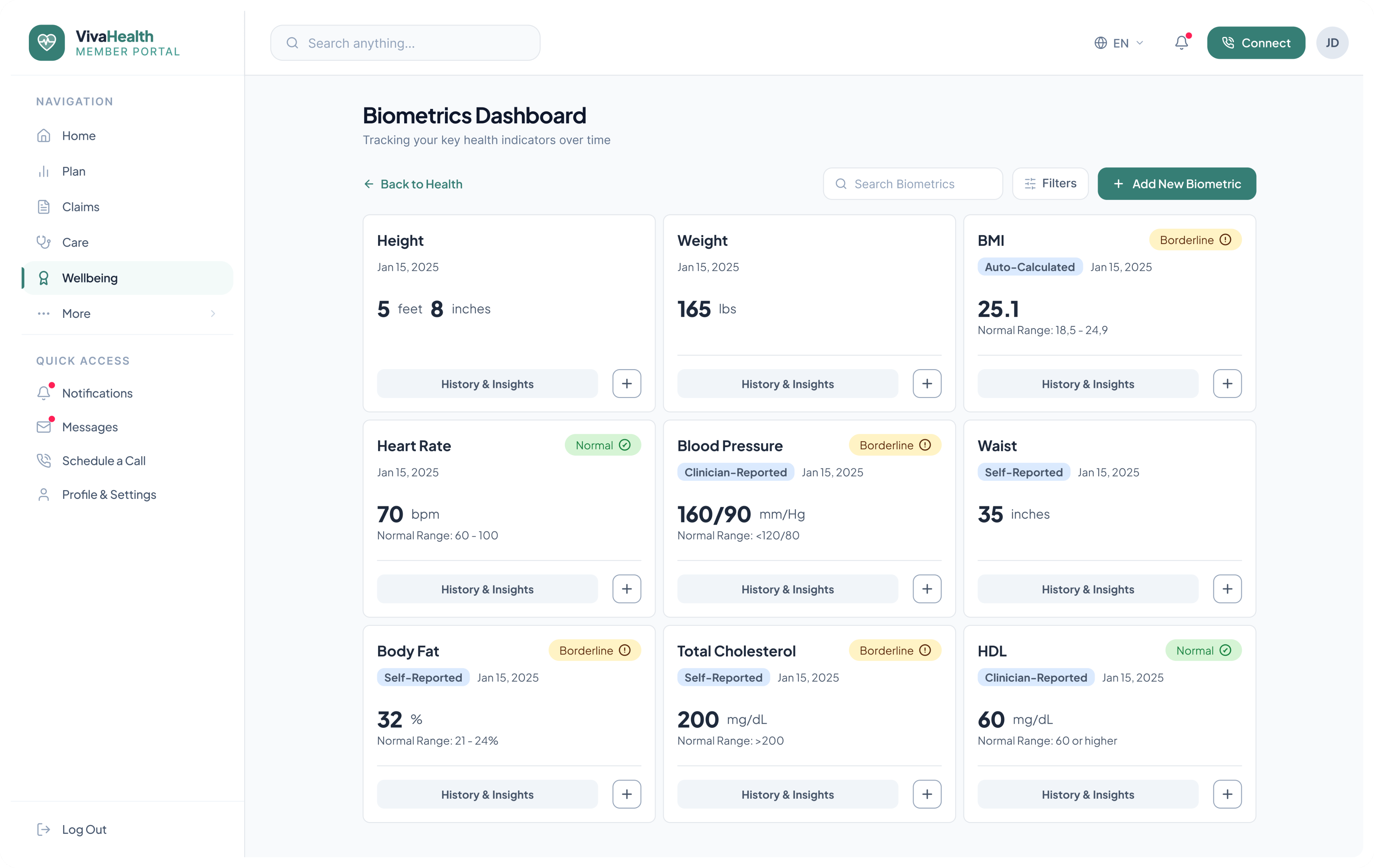
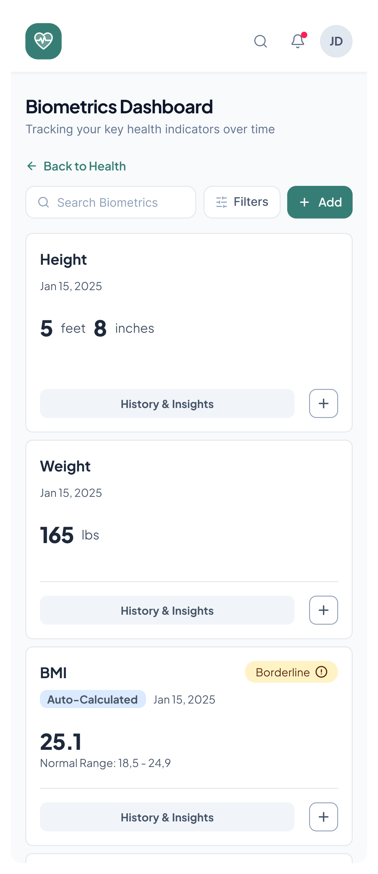
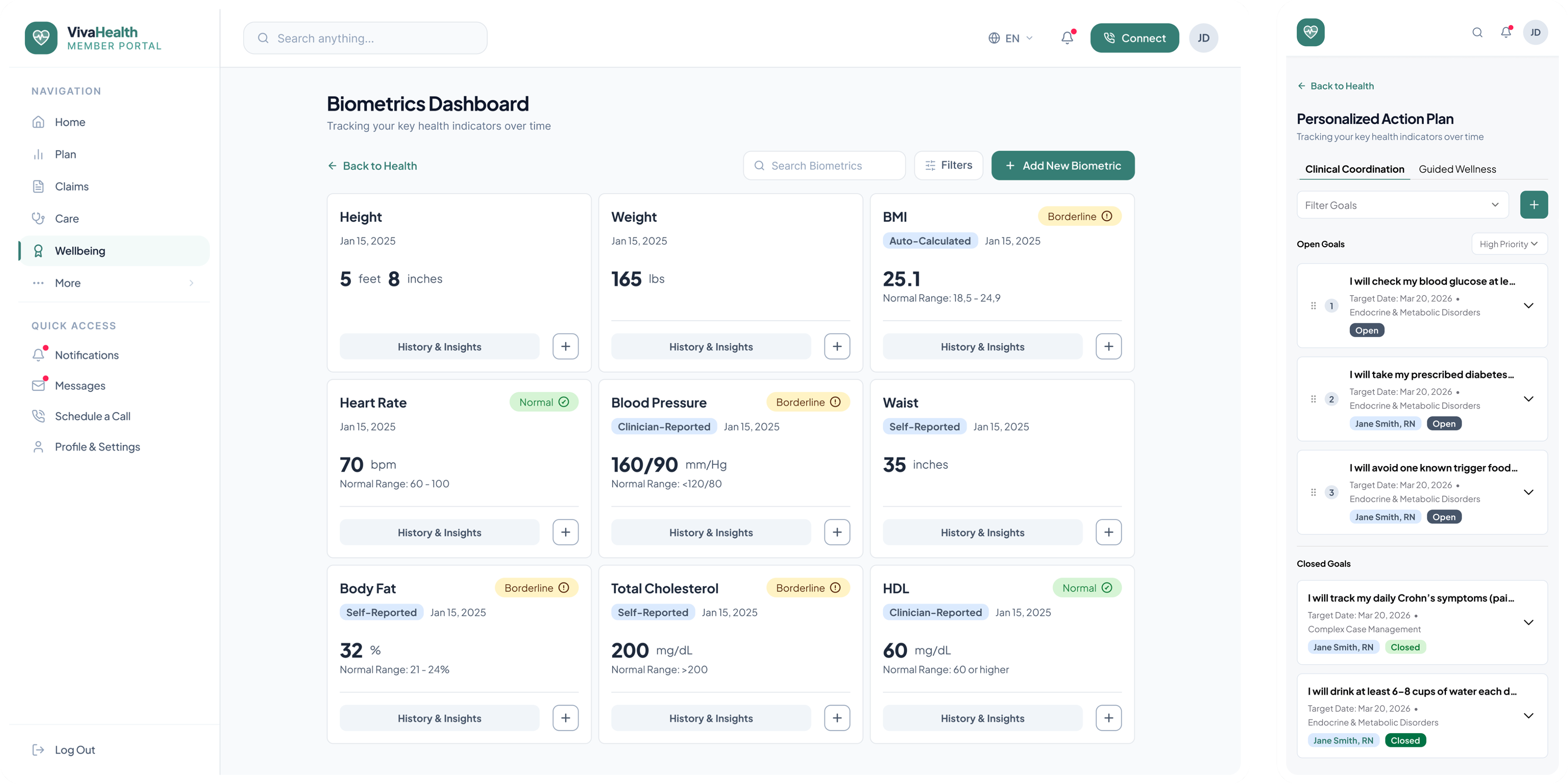
An anonymized healthcare dashboard shown in desktop and mobile views

Note: The interface has been rebranded for portfolio use using a fictional company name, logo and colour palette.

Overview

I worked with a US healthcare client on three interconnected member-facing wellbeing features: a Health Risk Assessment, a Biometrics Dashboard, and a Personalized Action Plan. Together, they formed a continuous journey that helped members understand their health, track relevant indicators, and act on personalized recommendations.

Challenge

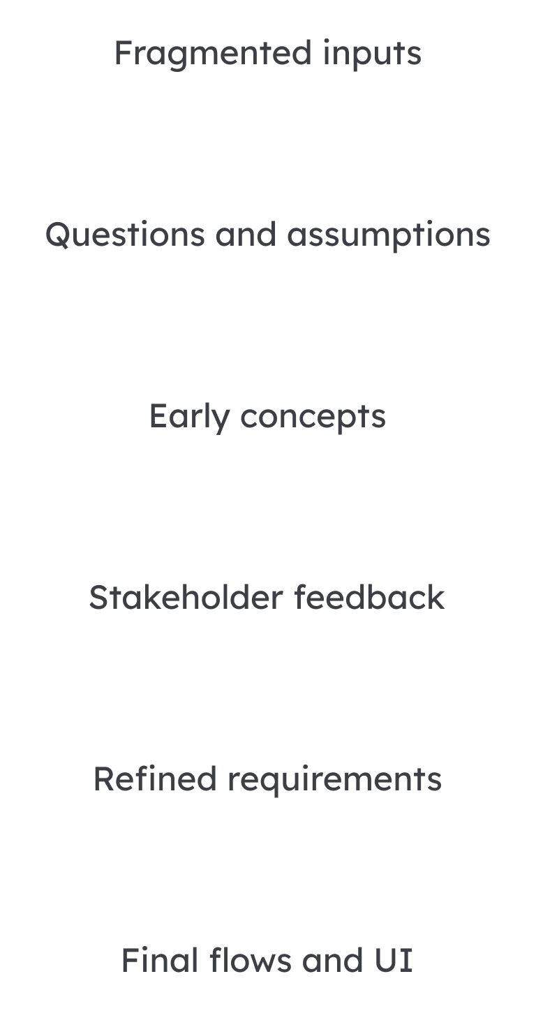
The project began without stable requirements. Early concepts helped clarify workflows and align multiple stakeholders while the design system was still evolving.

Key challenges: evolving requirements, complex stakeholder alignment and an emerging design system.

My role

I turned broad product ideas into structured user journeys, used early concepts to uncover missing decisions, aligned shared patterns with the design system while it was still in the early stage, and prepared detailed flows for implementation.

An early mobile healthcare product concept

Working with ambiguity

With limited opportunity for formal discovery, design became a tool for clarifying the product.

Early concepts gave stakeholders something concrete to respond to, helping uncover missing requirements and progressively define each feature. The design process did not begin after the requirements were defined — it helped define them.

Feature 1

Health Risk Assessment

Goal

Make a long and sensitive health assessment feel understandable, manageable, and safe to complete.

Key complexity

The main challenge was balancing clinical and business requirements with the effort of completing a long and sensitive questionnaire. Members needed to understand what was required, how much progress remained, and what would happen after submission.

Design decisions

I structured the assessment into clear sections and introduced preparation and progress guidance to reduce uncertainty throughout the flow. I also designed states for saving, returning, incomplete responses, validation, completion, and the transition into biometric data and health results.

Slide 1 of 3

Feature 2

Biometrics dashboard

Goal

Turn health measurements from multiple sources into a clear and trustworthy member experience.

Key complexity

With up to 13 biometric cards in a single dashboard, the key challenge was establishing a clear information hierarchy. I had to balance what was most useful to members with stakeholder expectations, while keeping the experience readable, visually balanced, and easy to scan.

Design decisions

I structured the dashboard around three levels of information:

  • Scan: current values and status;
  • Understand: reference ranges and data source;
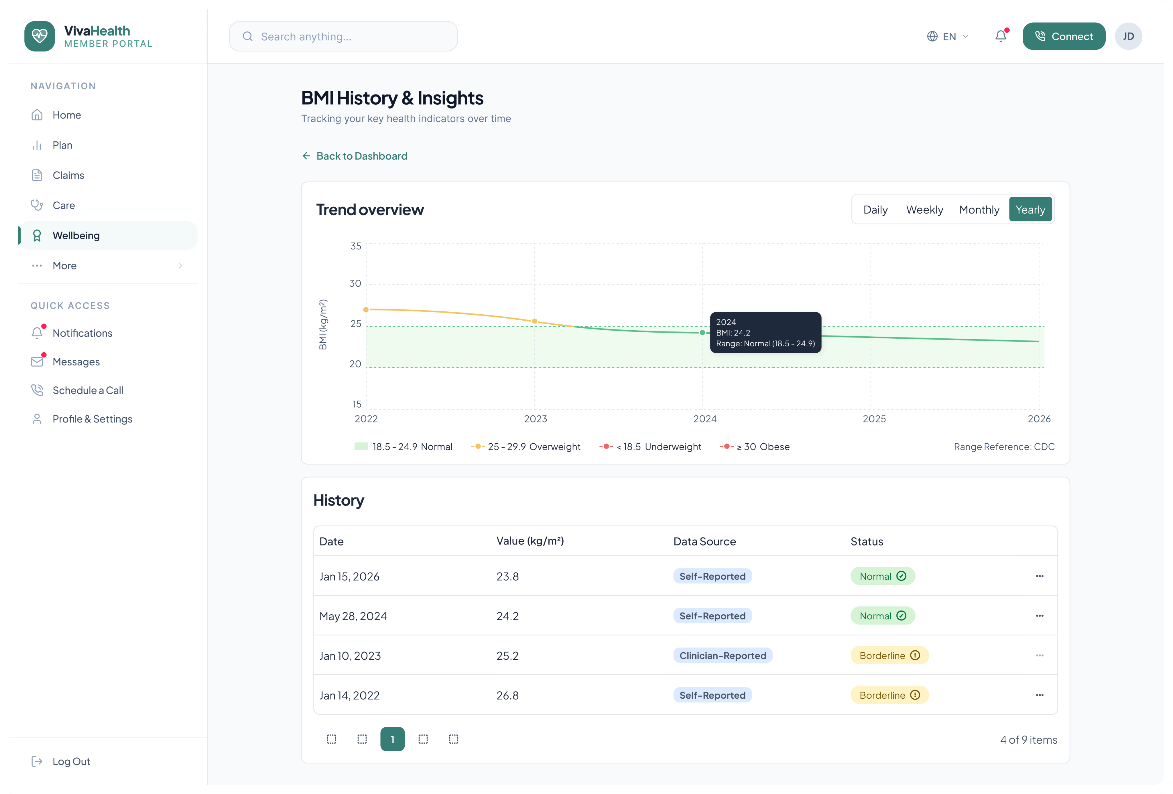
  • Explore: trends and educational context.

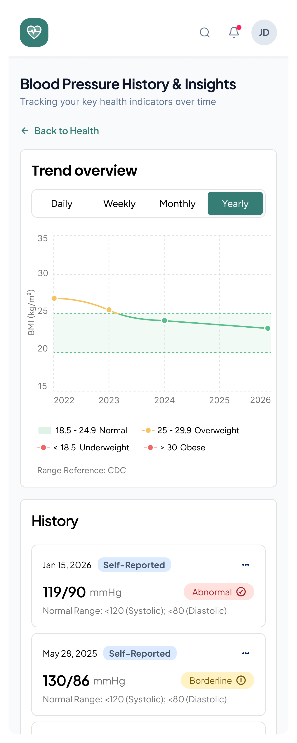
Reusable cards, status indicators, filters, and history views kept the main dashboard clear while supporting deeper exploration.

Biometrics dashboard interface, view 1Biometrics dashboard interface, view 2Biometrics dashboard interface, view 3Biometrics dashboard interface, view 4

Feature 3

Personalized action plan

Goal

Make clinical care goals understandable and actionable for members without exposing the complexity of the care-management system.

Key complexity

Goals could originate from different cases, clinicians, coaches, or members. The challenge was to translate this backend complexity into one clear, approachable member experience.

Design decisions

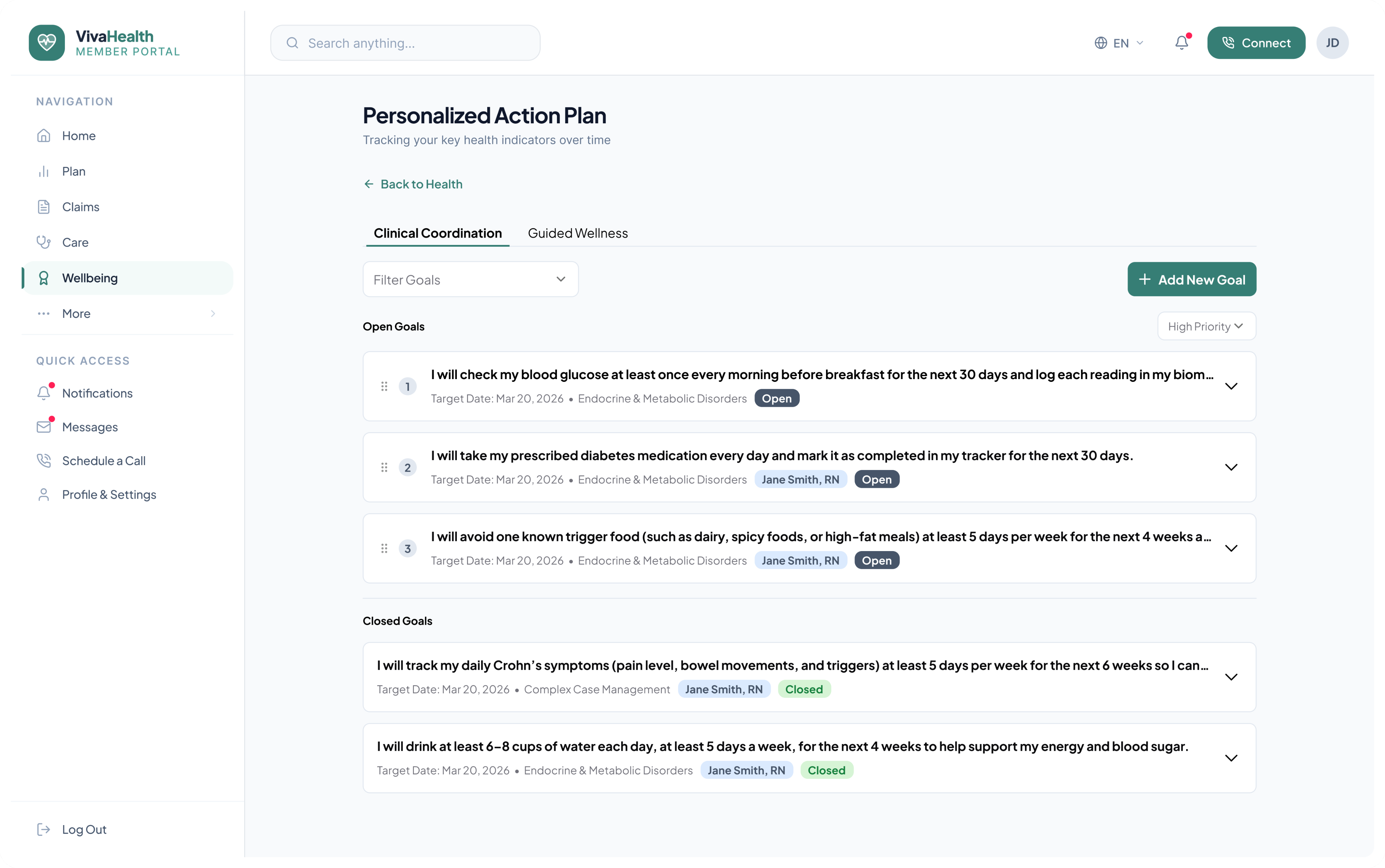
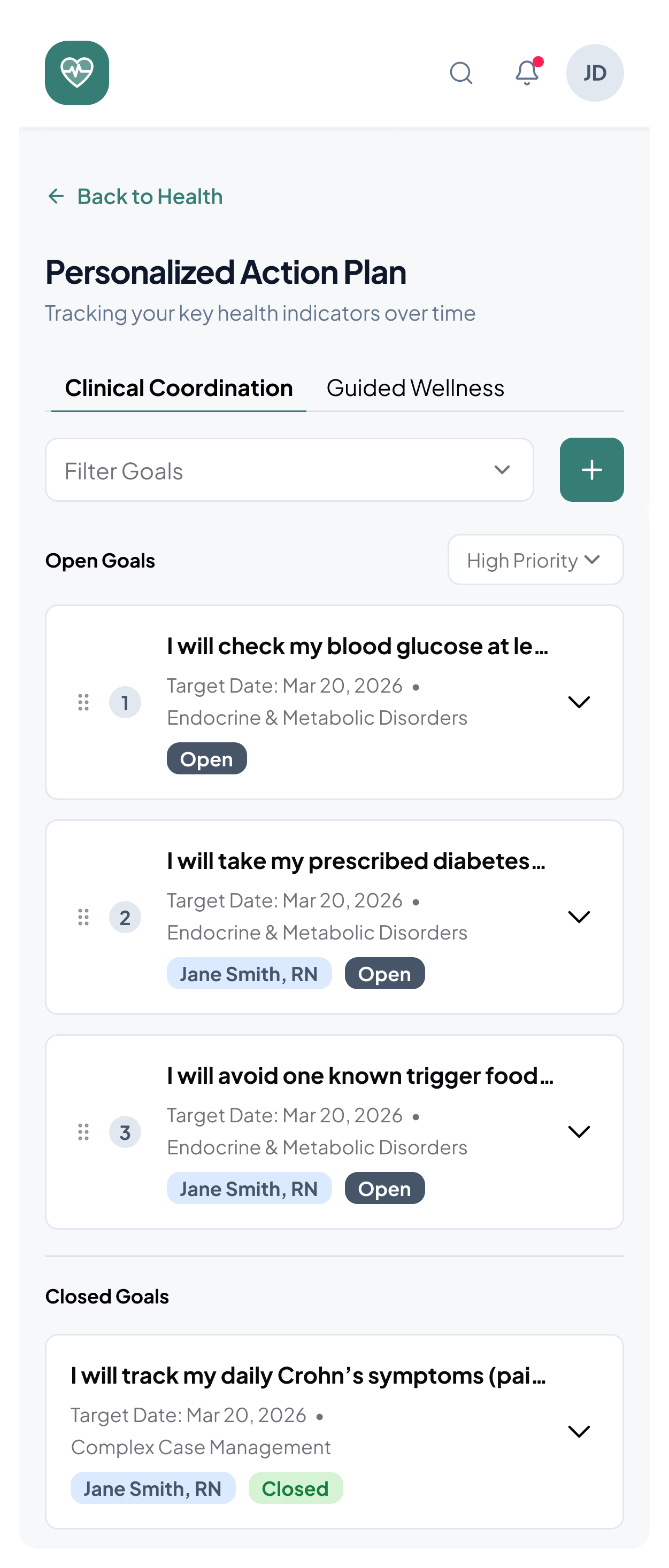
I organised goals by program and status, surfaced only the context members needed, and created clear patterns for viewing details, filtering, and adding goals. Internal terminology was replaced with clearer member-facing language while preserving alignment with clinician workflows.

Personalized action plan interface, view 1Personalized action plan interface, view 2

Outcome and contribution

  • Translated loosely defined concepts into implementation-ready end-to-end flows;
  • Uncovered missing requirements and platform dependencies;
  • Established consistent, reusable patterns across three connected features.

Reflection

This project showed how design can become a method of discovery when requirements are still evolving. Tangible flows made assumptions visible, supported clearer decisions, and allowed the experience to adapt through consistent information hierarchy and reusable patterns.

With more time, I would have validated the key flows with members and care professionals.