
Paulina Meska

Improving identity verification from feature to system

Role:
UX/UI Designer
Company:
Ondato
Industry:
Identity verification
Year:
2023
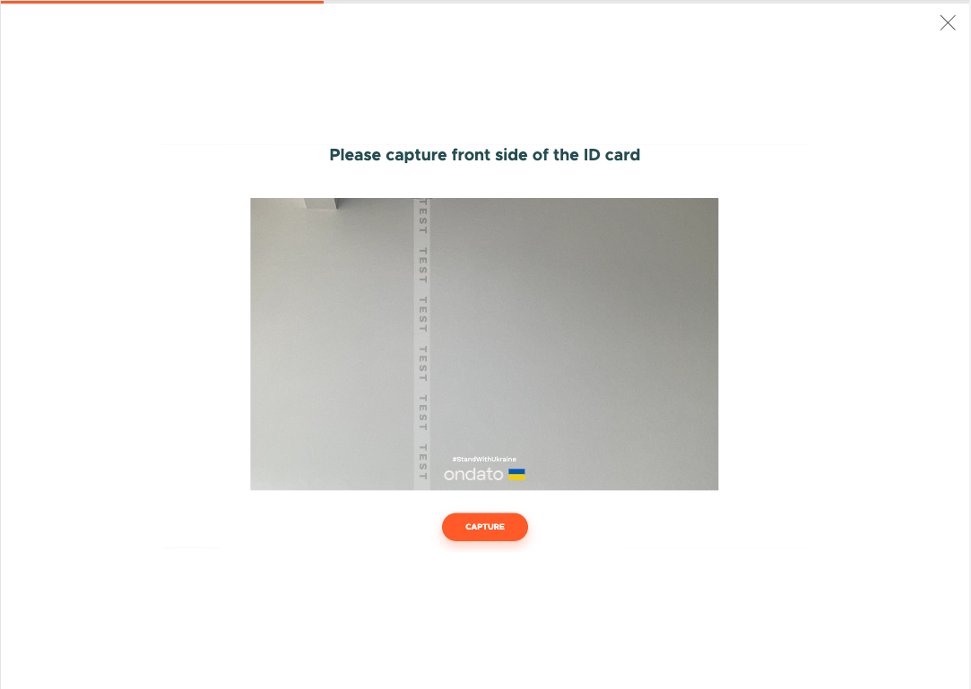
Ondato identity verification screens across desktop and mobile devices.

Overview

At Ondato, I worked on a broader redesign of the identity verification product, spanning research, interaction design and design systems. This case study shows that work at two scales: a focused improvement to document auto-capture and the creation of a scalable white-label foundation for the wider product.

Challenge

The challenge was to improve individual parts of the identity verification journey while creating a more consistent and reusable product overall. Each solution needed to work within a shared system and remain flexible enough to support different client brands—without designing and maintaining a separate experience for each one.

01

Improving document capture

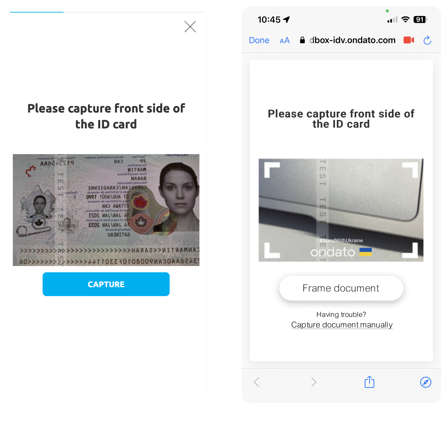
Document capture is a critical part of the identity verification flow and the business wanted to introduce auto-capture to improve the experience. Once the technology had been prepared by developers, we needed to validate whether it actually worked better for users than the existing manual capture flow before completing the redesign.

Research

Together with another designer, we conducted usability testing with 16 participants. To minimise order bias, half of participants completed the manual flow first, while the other half started with auto-capture. We combined observations, short interviews and the System Usability Scale (SUS) to compare both experiences.

Results: The preferred method by 62.5% of participants was auto-capture, but usability testing also revealed several issues that shaped the final design.

Key findings

FINDING 1

Capturing felt too fast

Insight: Auto-capture happened so quick, users weren't sure when the document had been captured.

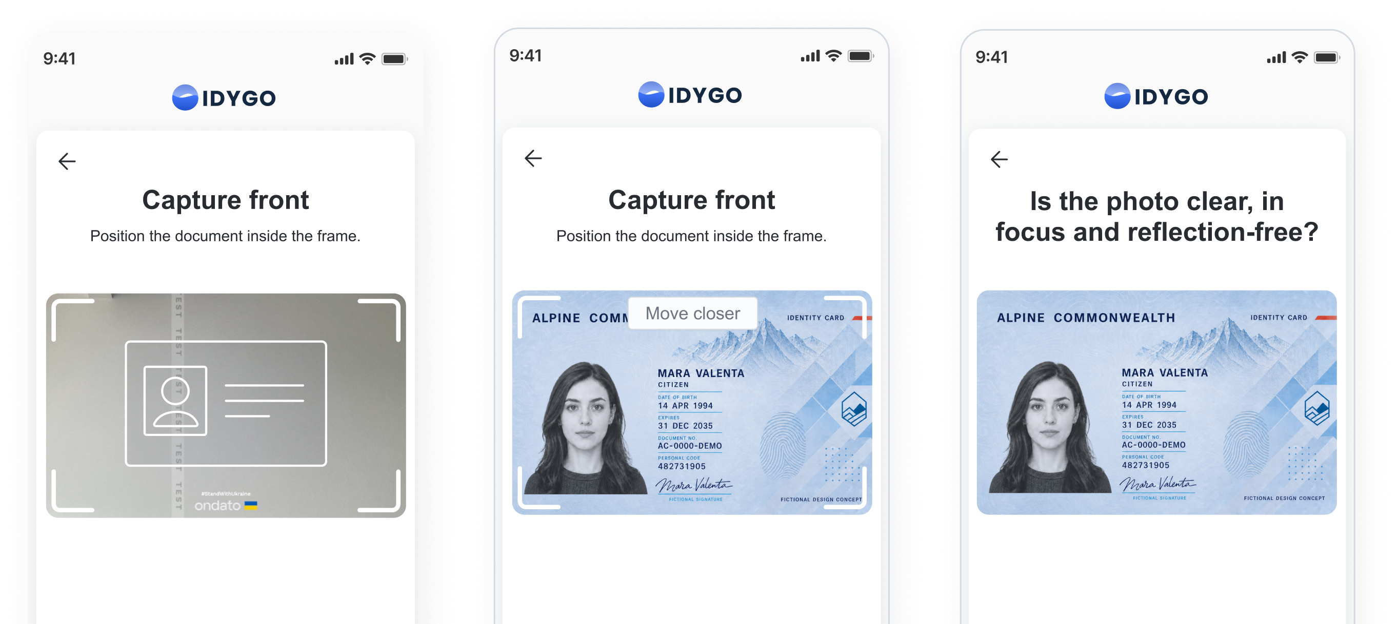
Design decision: Extend timing + add frame animation to indicate capturing action.

FINDING 2

Instructions were overlooked

Insight: Guidance wasn't noticeable enough during capture.

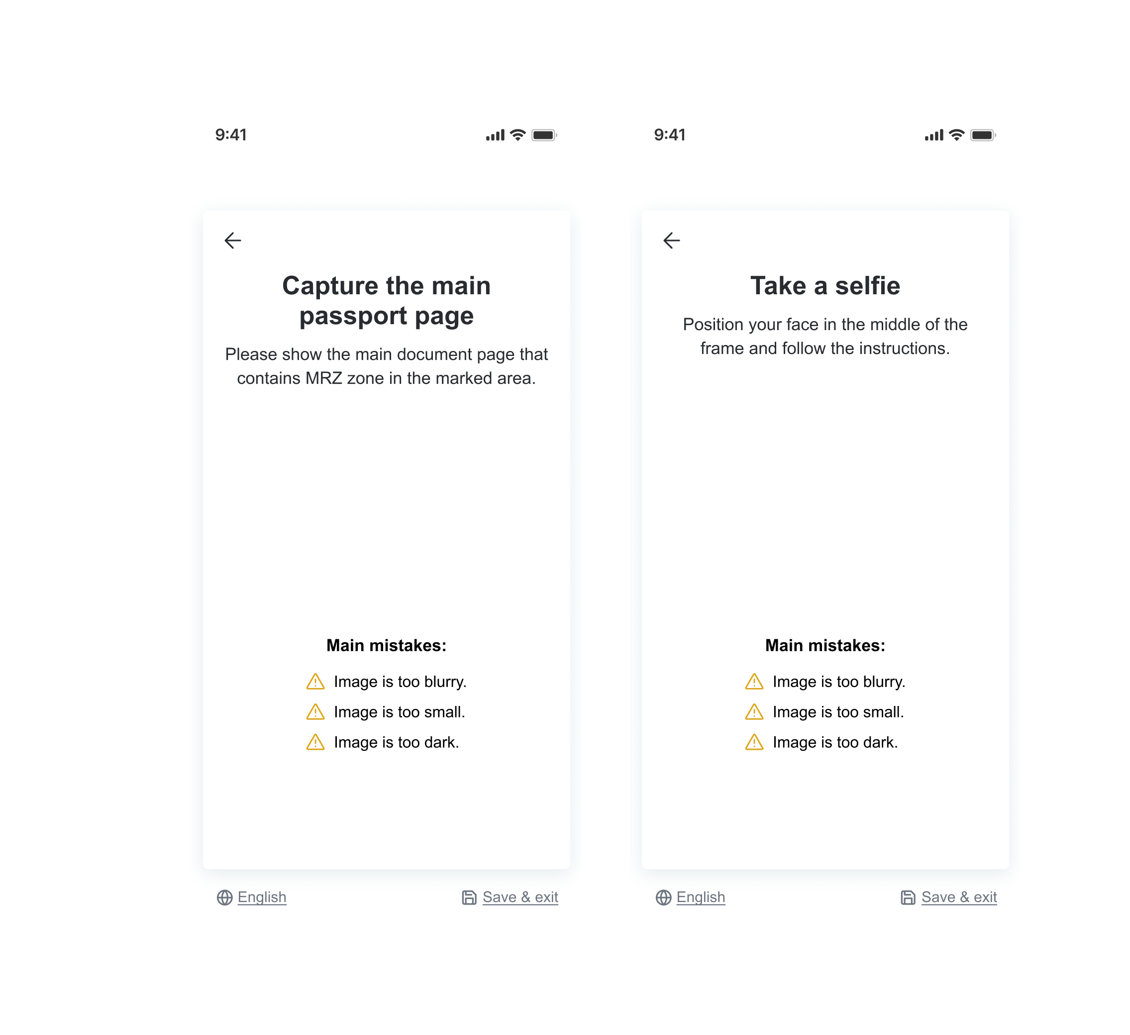
Design decision: Improve contextual guidance.

FINDING 3

Auto-capture wasn't suitable for everyone

Insight: One participant struggled because their shaky hands made it difficult for auto-capture to recognise the document.

Design decision: Add manual fallback after 10 seconds.

FINDING 4

Confirmation was unclear

Insight: The original approval modal created confusion.

Design decision: Replace current modal with a simple confirmation screen.

Final experience

Research shaped a clearer capture flow with stronger guidance and a manual fallback. Stakeholders approved the direction, and auto-capture became the primary experience. However, legal restrictions prevented post-launch behavioural tracking.

Capture front

Position the document inside the frame.

Document positioned in the camera capture area
Slide 1 of 5

Initial auto-capture state.

02

Building a scalable white-label system

Because Ondato is a white-label product, the interface needed to remain consistent while adapting to different client brands.

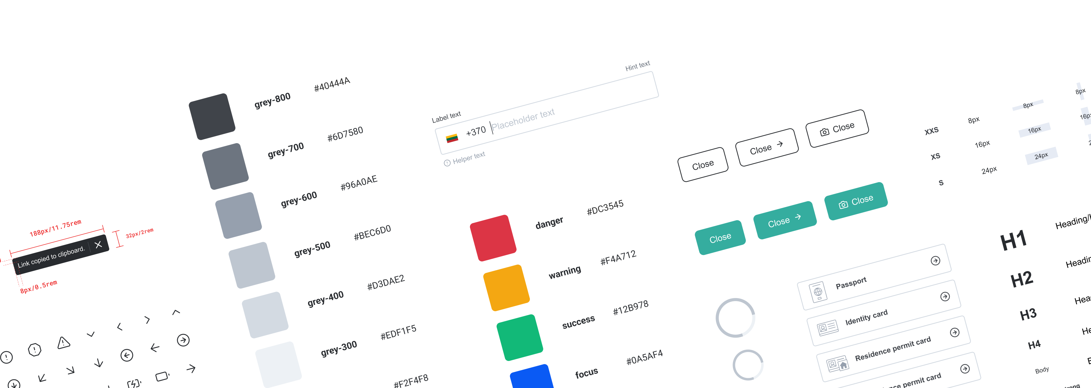
To create the design foundation, I audited the existing interface and identified recurring UI patterns. Based on these findings, I created the initial design foundation covering typography, colour, spacing, components and implementation guidance. The goal was to create reusable foundations that could support both design process and developers as the product evolved.

Designing for different
brands

The main challenge was creating a system that could work with any client colour while keeping the product visually consistent. I introduced a neutral grayscale foundation with a dynamic primary colour model, allowing branding to adapt consistently across components and illustrations.

The same principle informed the illustration style, which was designed to remain recognisable while adapting to different brand colours.

Reflection

At Ondato, auto-capture was one of many features I worked on as part of a broader product redesign. Alongside feature improvements, I also helped build the design system and define illustration style, with each decision grounded in user and business needs. This required thinking beyond individual screens and considering how each solution would contribute to a more consistent, reusable and scalable product experience.